Spotify for Android
Background & Problem
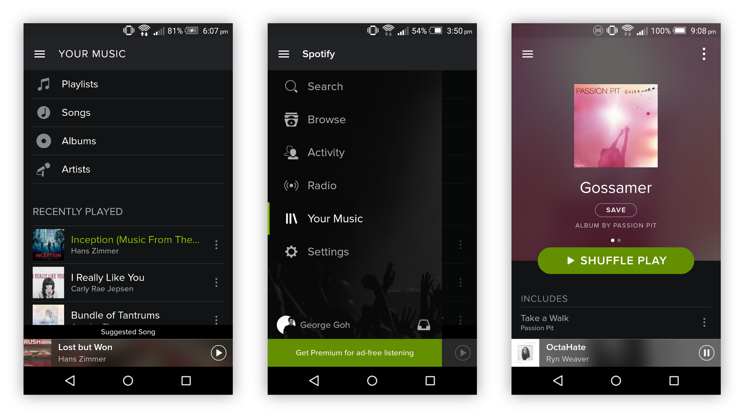
Spotify Android App (Early 2015)
The early 2015 version of Spotify’s Android app had always felt uninspired to me; it was almost a direct port of the iOS app and never felt like it was tailored for Android users. Like the desktop app, it was text-heavy and felt monotonous.
Goals
Objective
Given the limited time I had, I broked my goals down into 3 key points:
1. Apply Material Design guidelines to help the app feel more at home on Android, while preserving Spotify’s signature branding
2. Implement the visual language system used to categorise content which I designed for the desktop app
3. Innovate, by design, upon elements of the app in order to connect the service to users at a more emotional level
Development
Material Design
Visual guidelines for whole platforms like iOS and Android are some of the most exhaustively designed systems, and they exist to lend an anchor to the users experience across the many apps and services they will use.
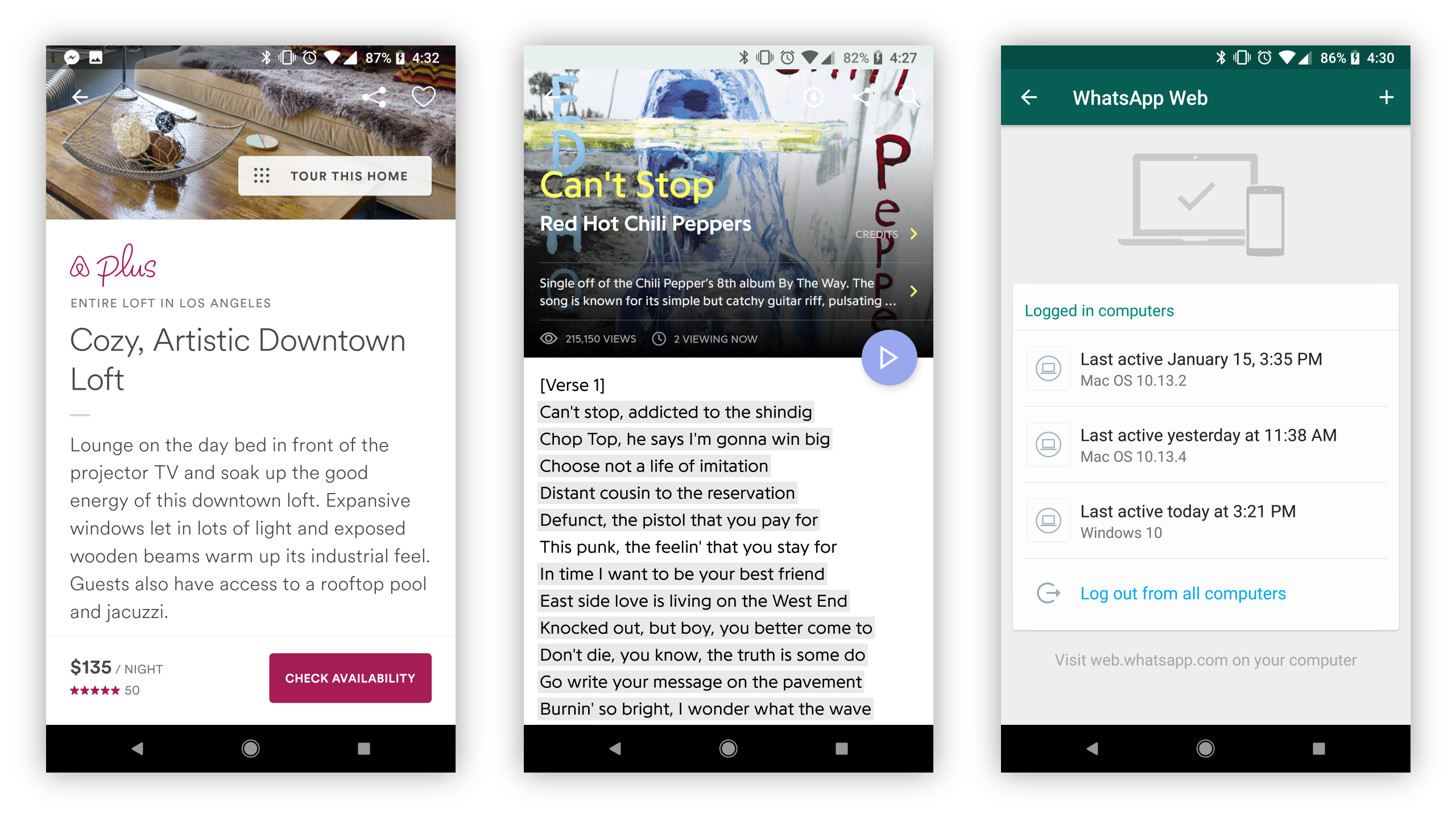
Right: apps from Airbnb, Genius, and Whatsapp have all pulled off balancing Material Design with their own branding and identity for unique yet familiar experiences.


Development
Adapting visual system for Android
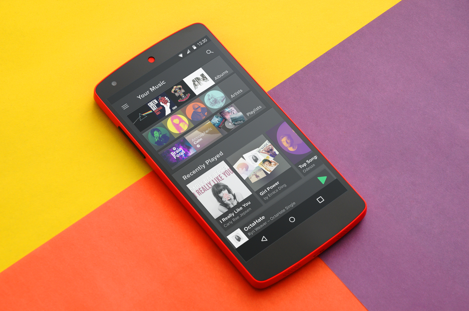
I adapted the visual system for the desktop app onto the content cards used in Material Design. The cards enable displaying different categories of content harmoniously in a row, such as on the home page frequently played section.
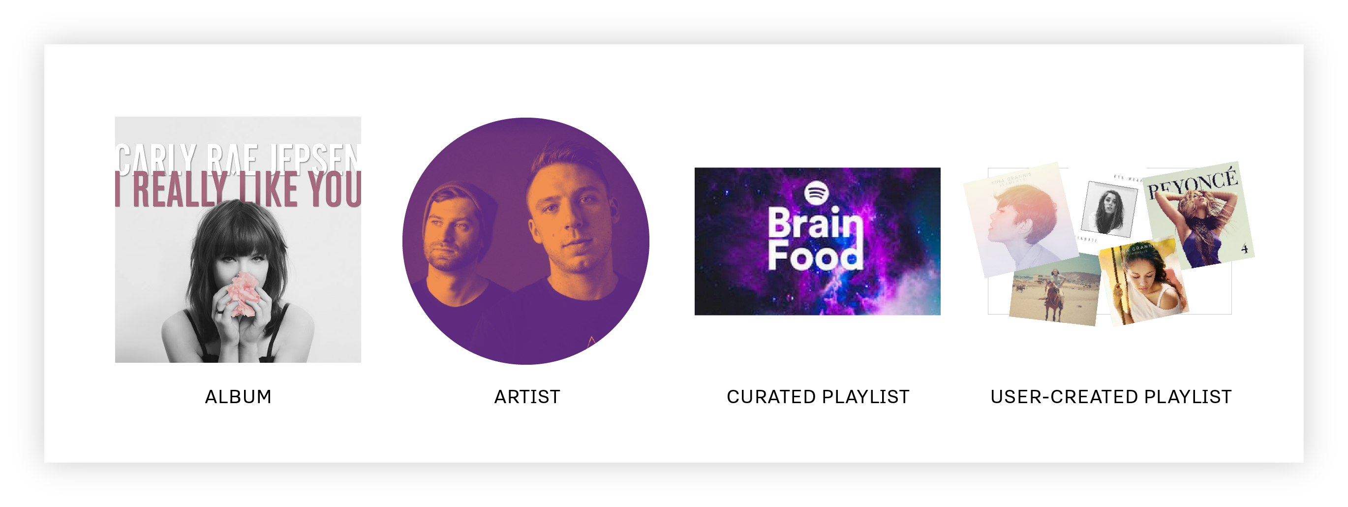

Cards can be adapted for displaying only 1 type of content, in this case, playlists:

Adaptive thumbnails on the now playing bar works just as well translated to the Android version.

Delivery
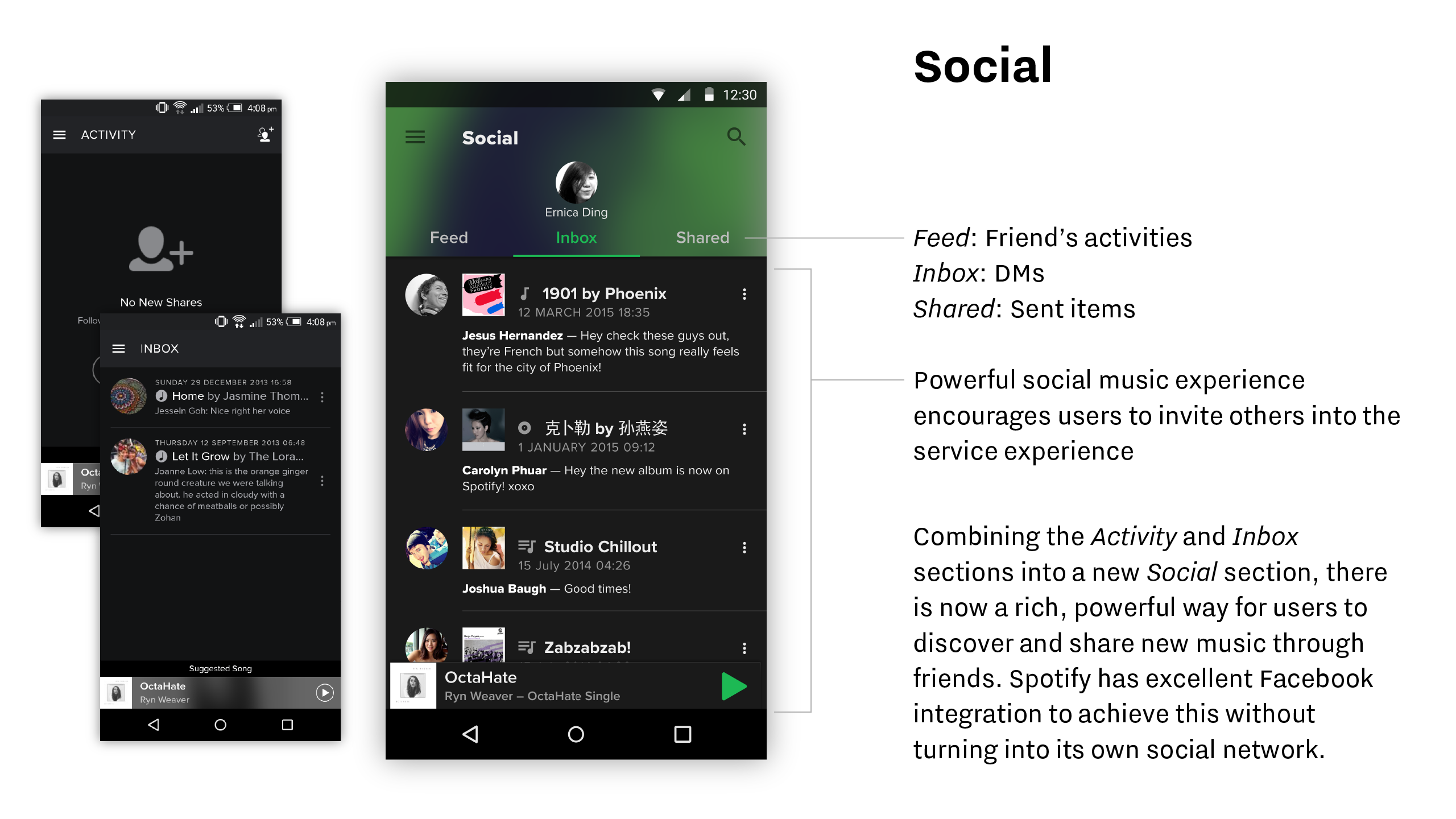
Screens and UX Enhancements


Impact
The Evolution of Material Design
Compared to the desktop app redesign that I did, Spotify’s Android app has changed in an entirely different way from what I did above.
Material Design has evolved into a less prescriptive set of guidelines compared to its debut in 2015. For that good reason, apps no longer has to look drastically “Googl-y” or different from their iOS counterparts to look like part of the Android OS.
Material Design has evolved into a less prescriptive set of guidelines compared to its debut in 2015. For that good reason, apps no longer has to look drastically “Googl-y” or different from their iOS counterparts to look like part of the Android OS.