Spotify for Desktop
In 2015, I worked on an interview exercise to improve parts of Spotify’s app experience. I started with the desktop app, before moving on to the android app.
Personal Project
Personal Project
Background & Problem
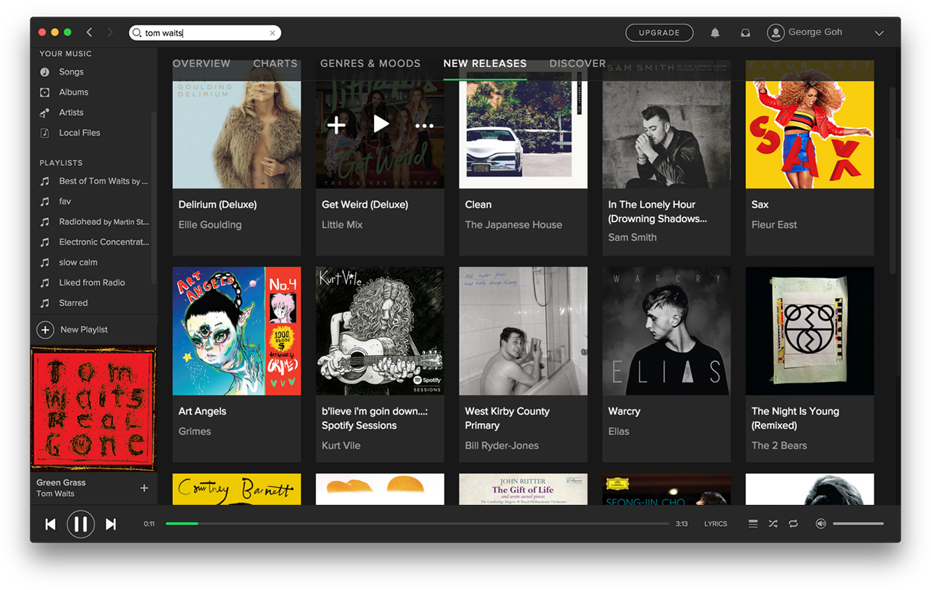
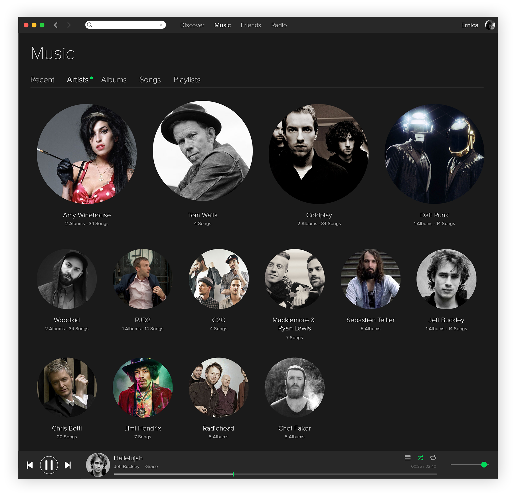
Spotify Desktop App, Early 2015
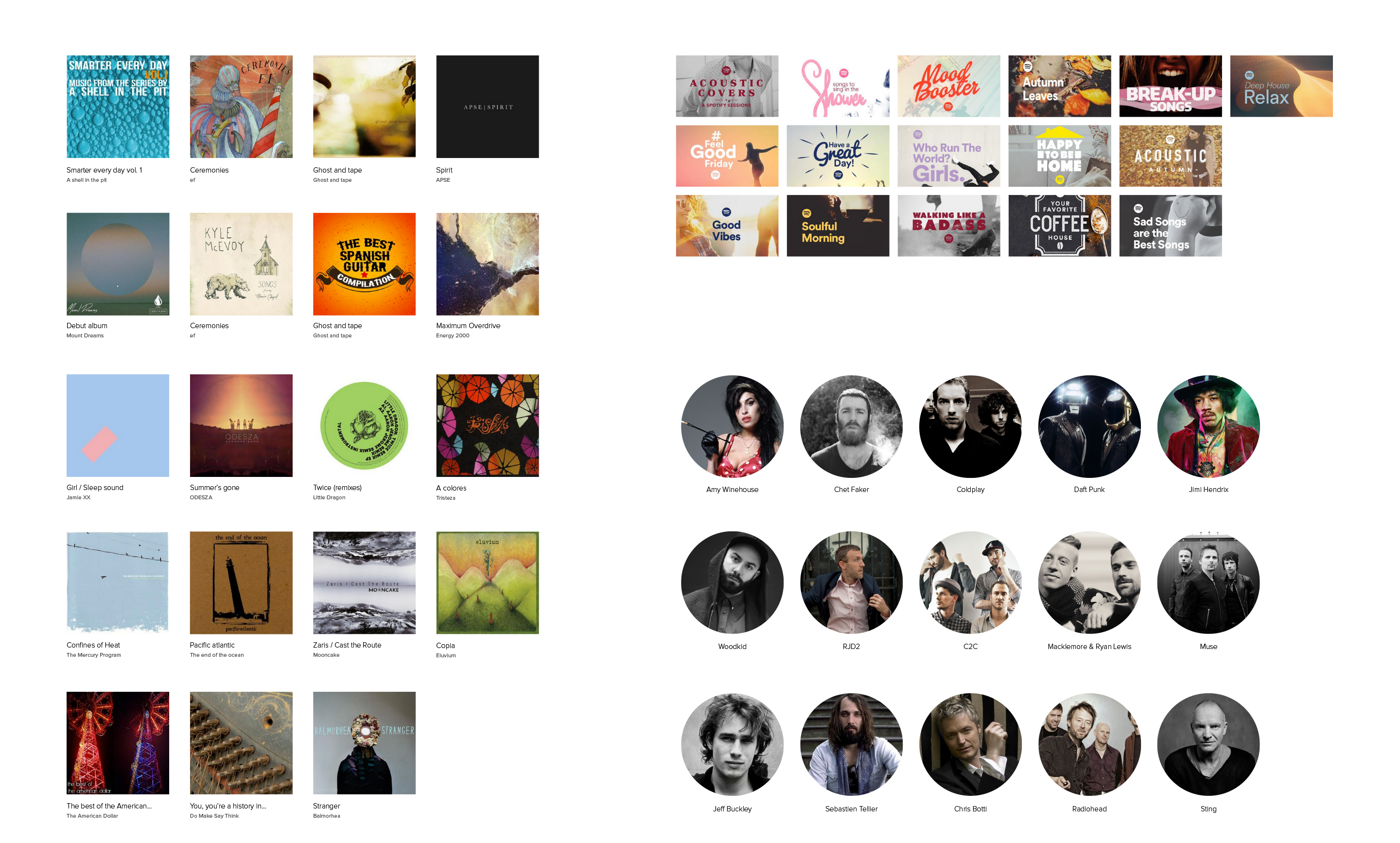
Music is emotional and expressive, yet Spotify’s desktop app is spartan and tool-like. The main content area suffers from lack of context, with users often getting lost in the depths of the IA.
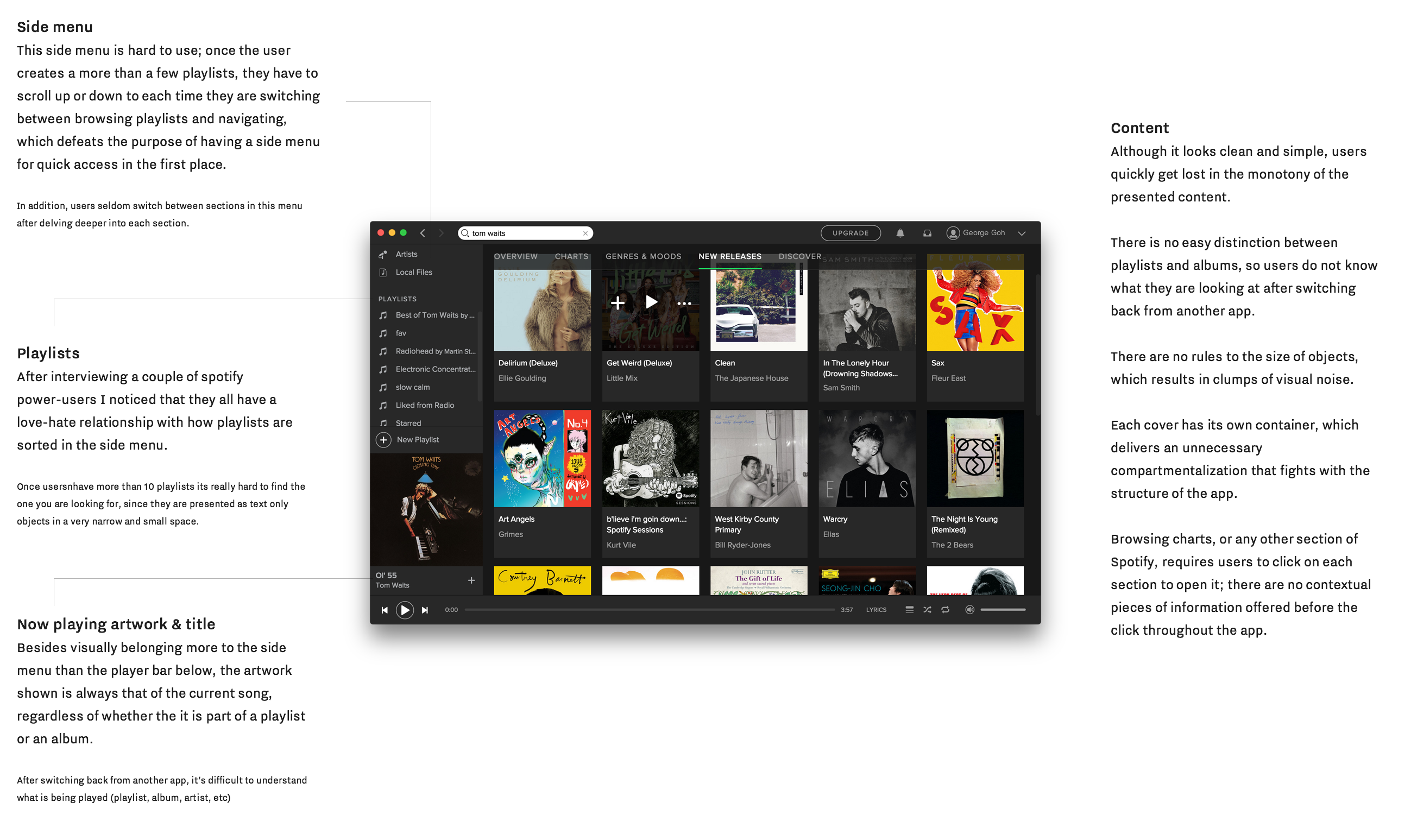
The side panel becomes crowded as users creates playlists, while the ‘now playing artwork feels misplaced here.
The side panel becomes crowded as users creates playlists, while the ‘now playing artwork feels misplaced here.

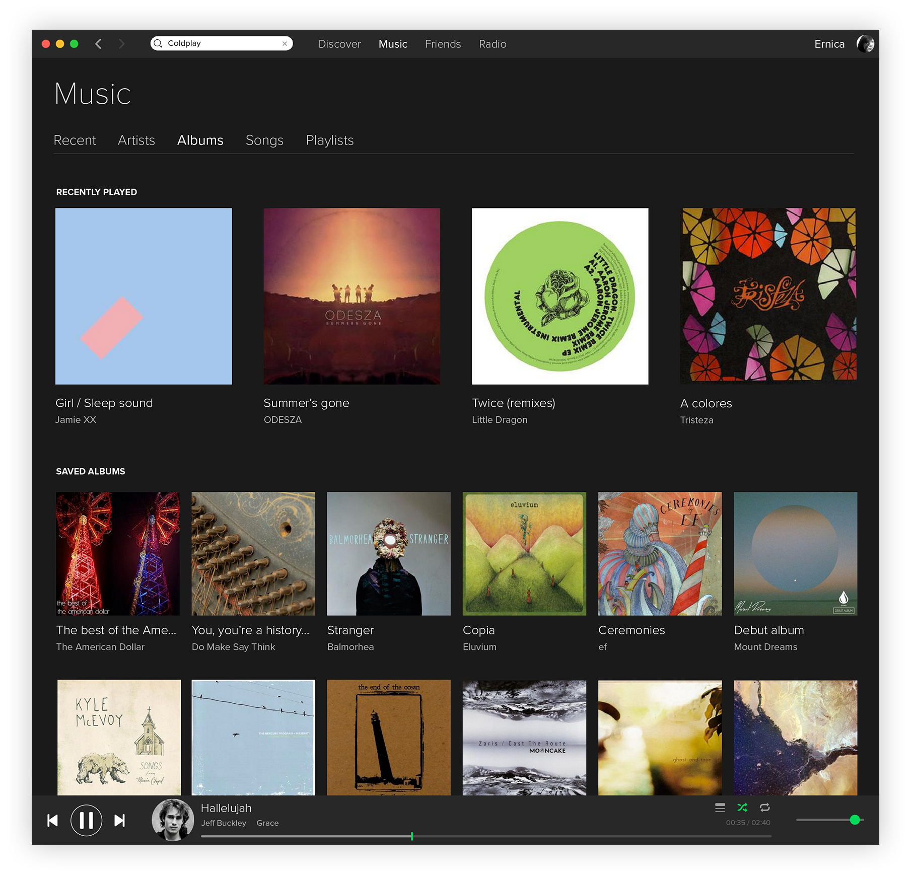
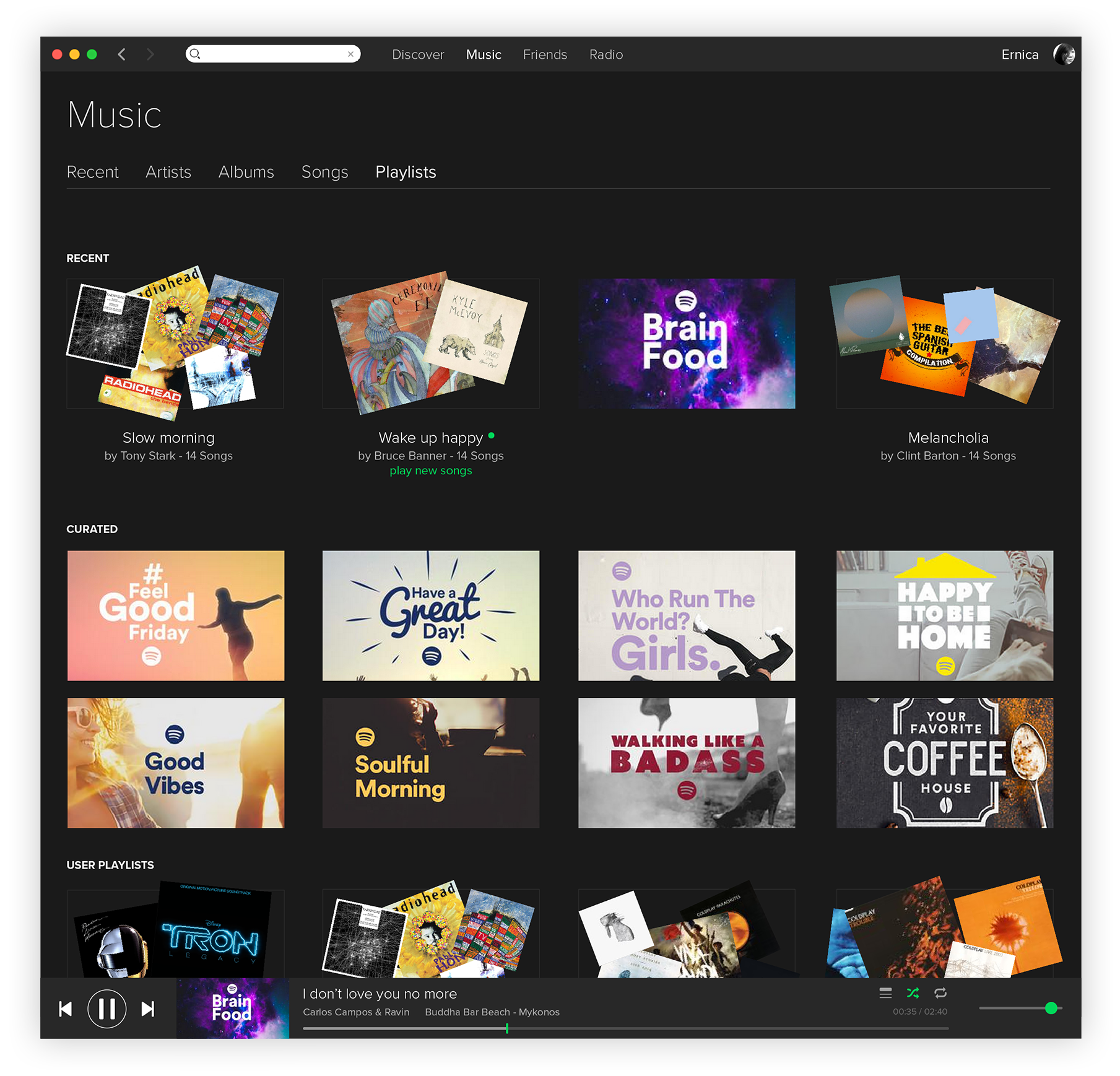
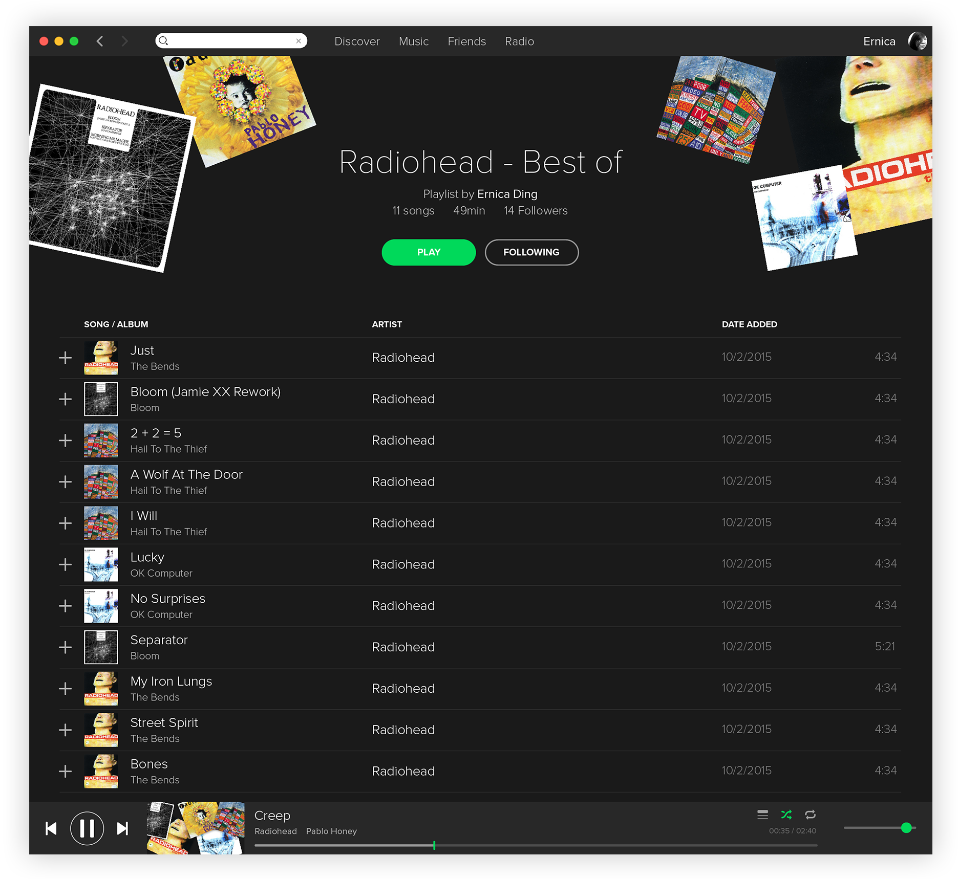
Here’s a deeper analysis into the app layout:
Development
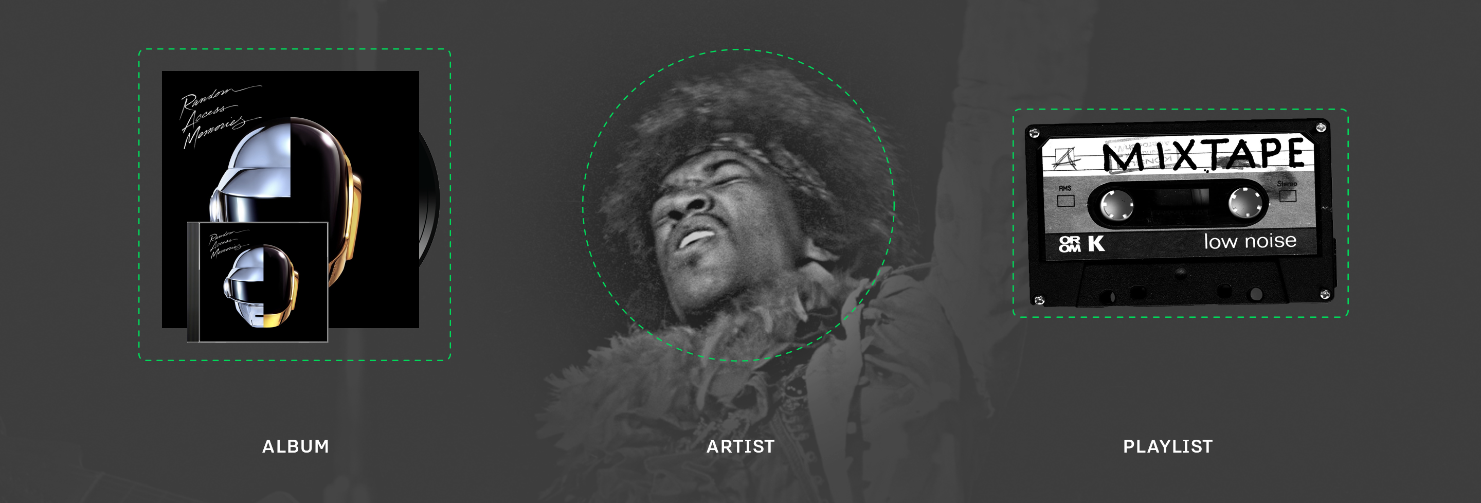
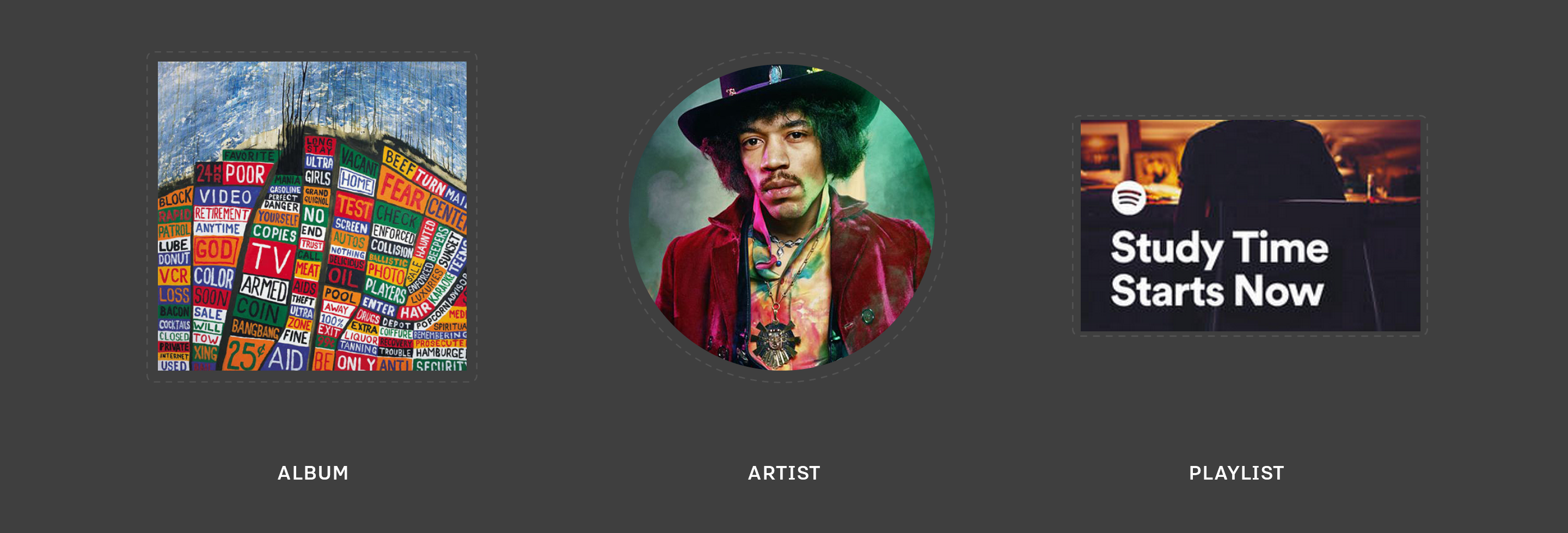
A Visual System for Organising Content
Applying a visual language system derived from the 3 main types of content on the service allow users to quickly make sense of what they are looking at.
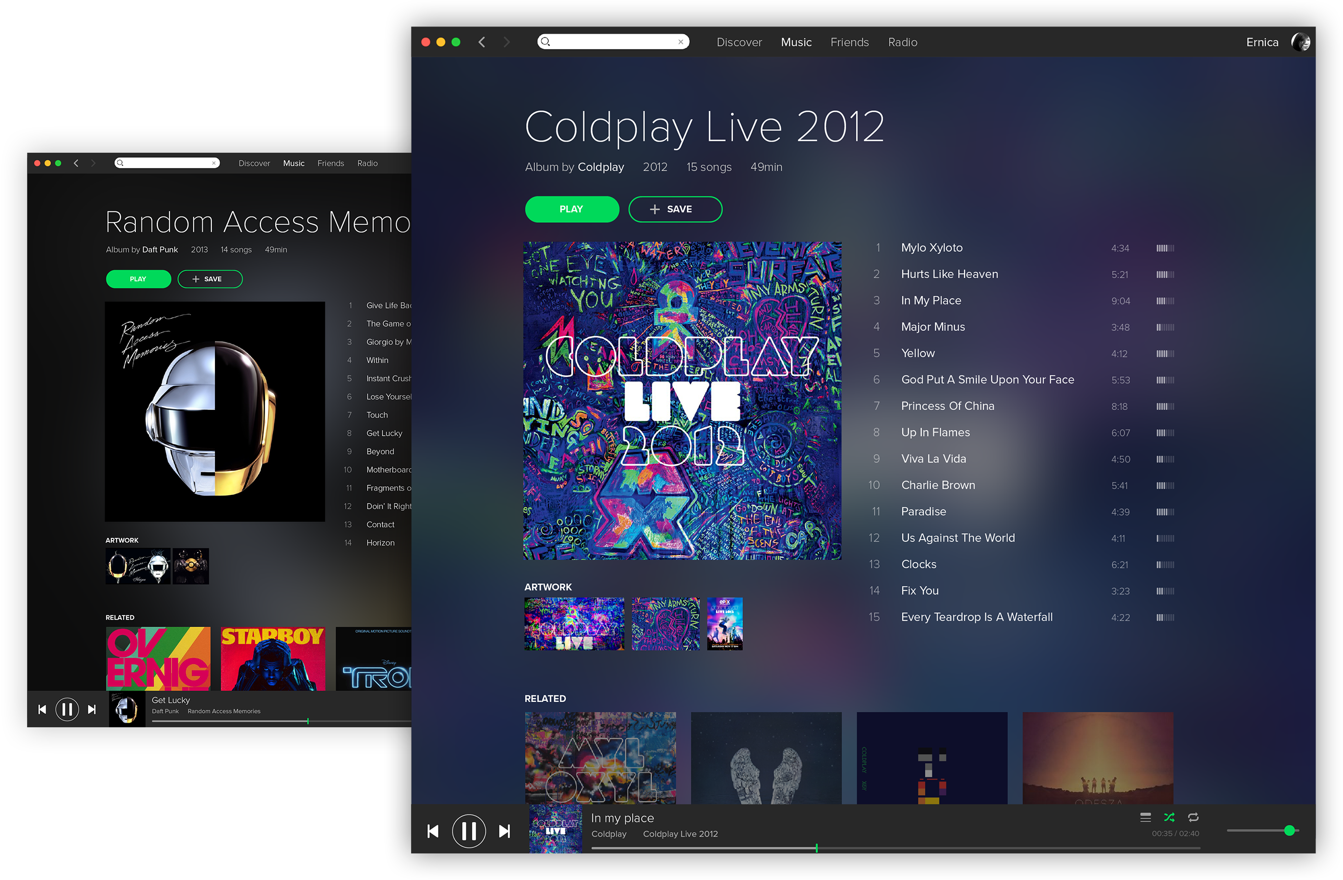
A new layout divided into 3 main sections gather all navigation towards the top of the app while now playing elements are combined into the persistent bottom bar.
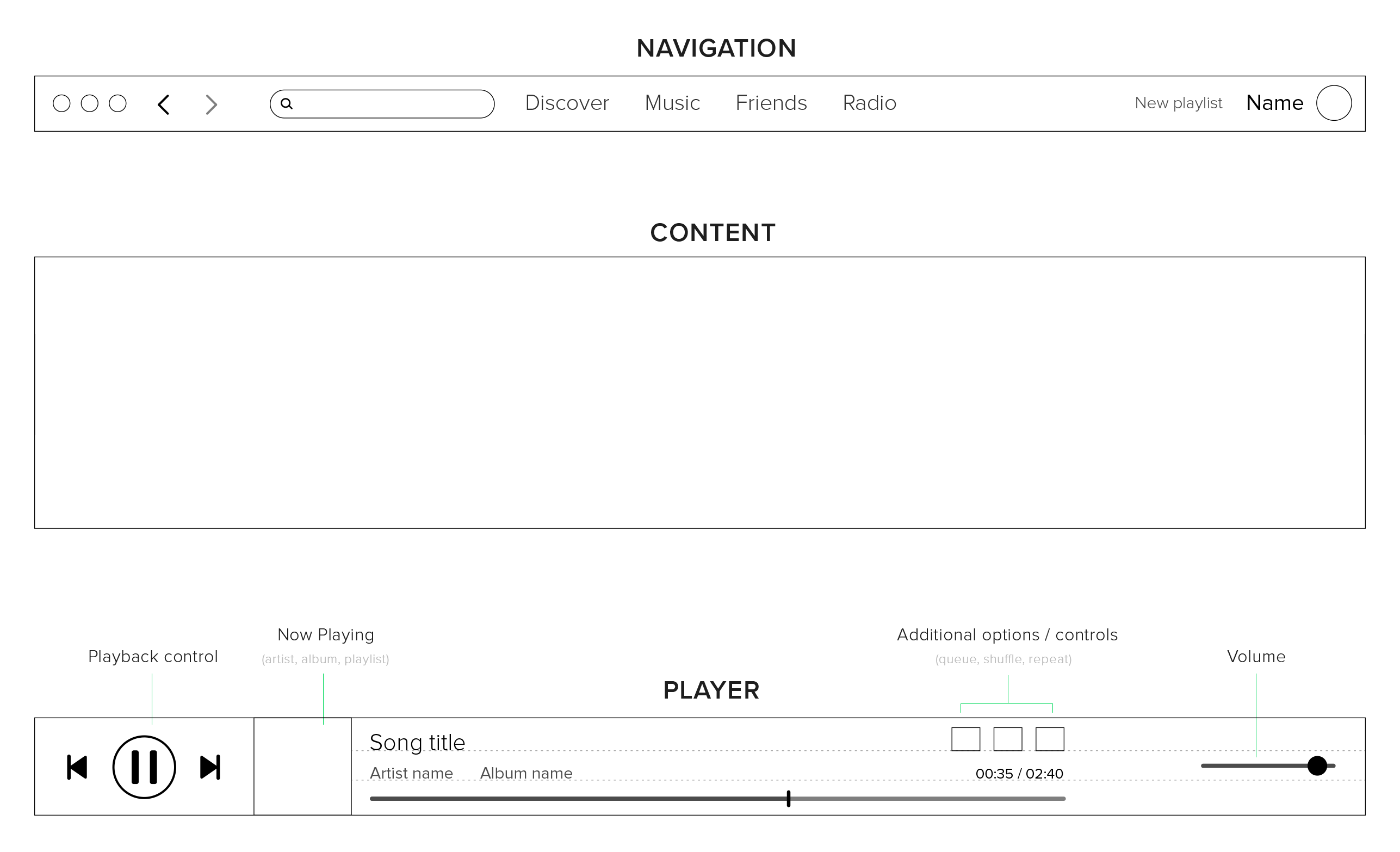
Now playing artwork is responds to the visual language system to inform the user instantly what is playing.
Delivery
Implementation
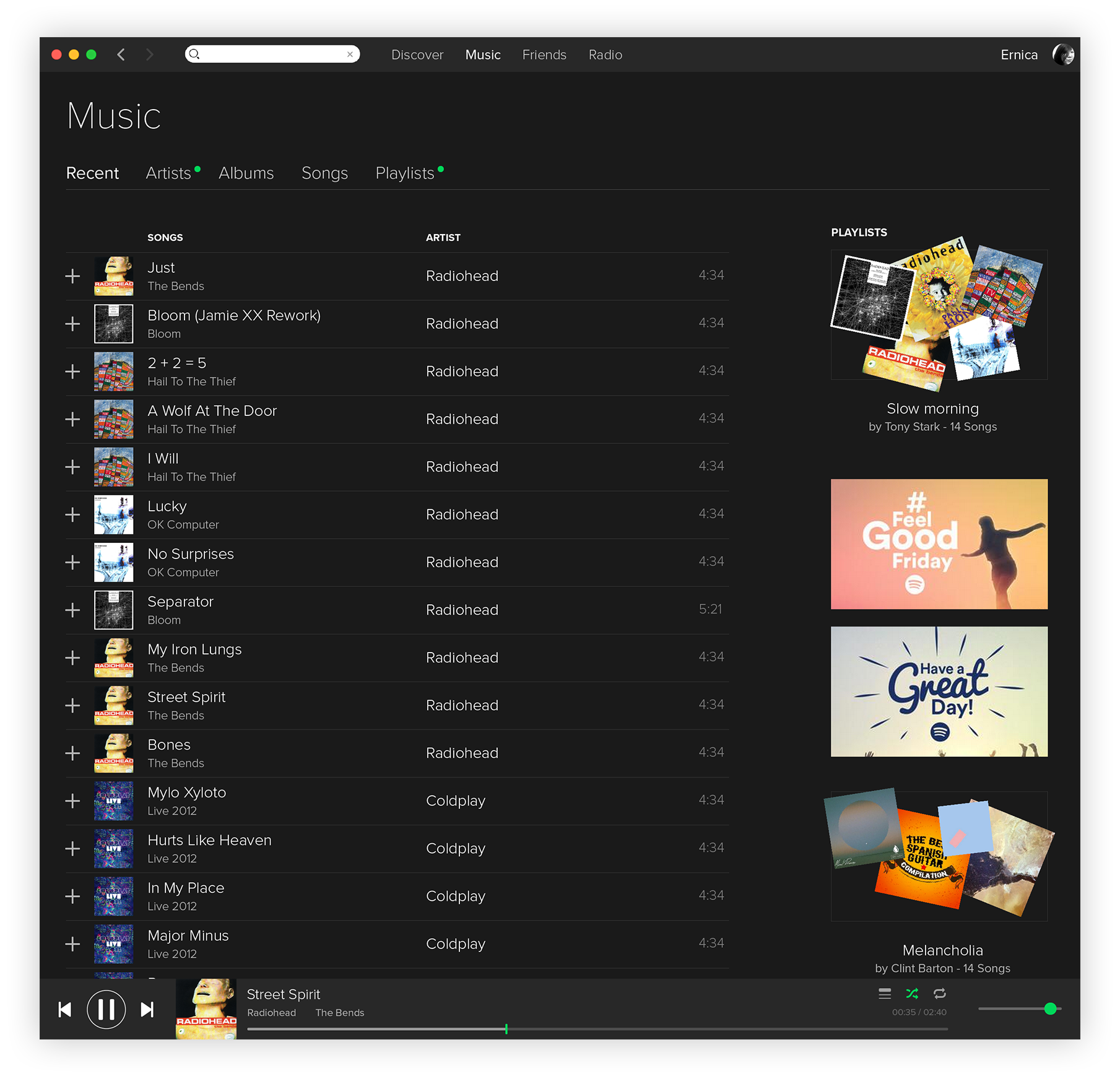
Users are able to intuitively understand where they are in the app, what content they are looking at, and recent content is always gathered at the top. There’s also a recents section here that gathers all the last songs played.
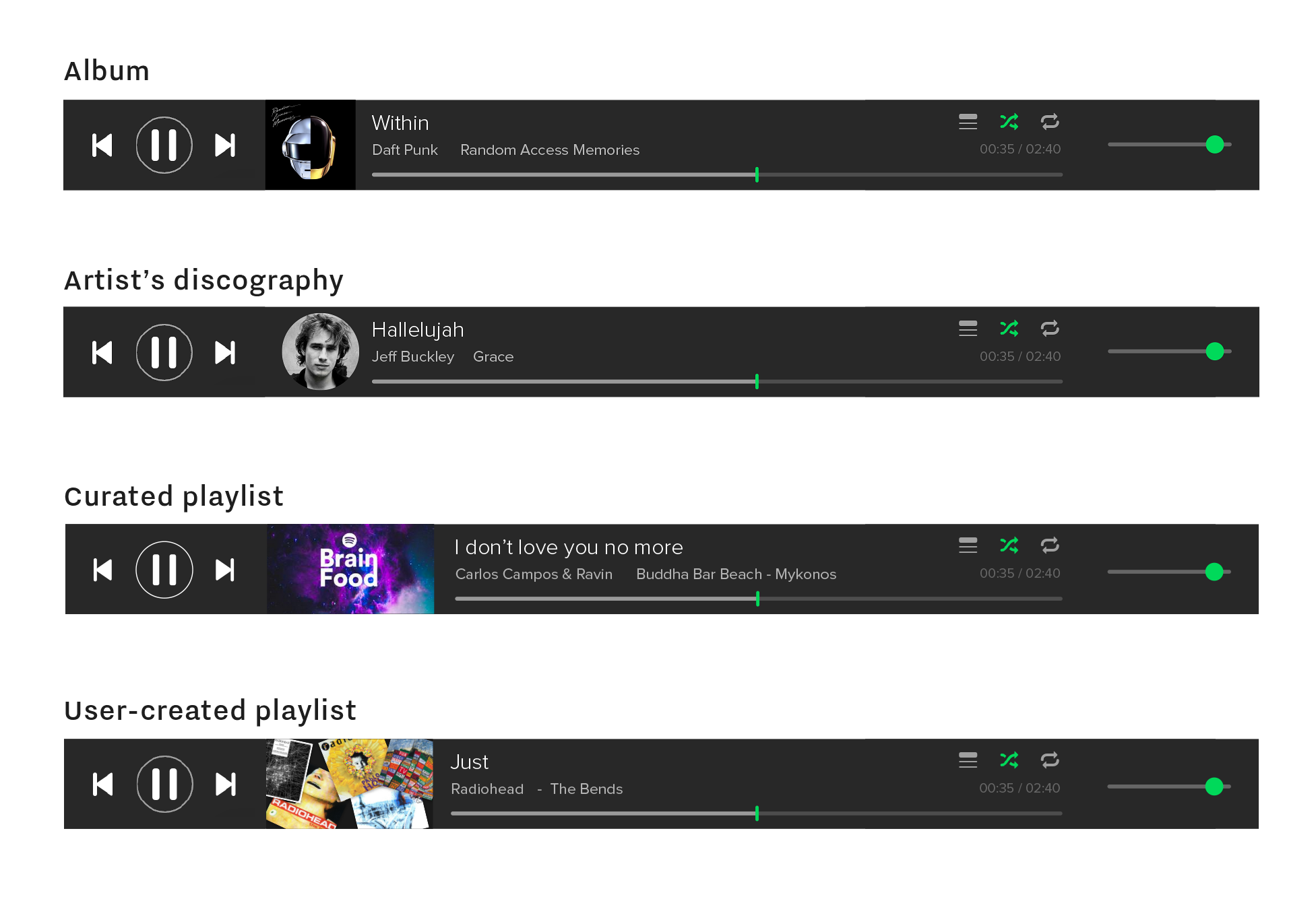
Here’s a deeper dive into the design of the artwork for user-created playlists:

Curated playlist vs. user playlist

Album pages now puts each album’s artwork in the spotlight, conveying the tone and mood intended by the artist. The experience is a digital recreation of uncasing and enjoying an album and it’s printed booklet from start to finish.
The Discover tab now has an overview page where top recommendations are given the spotlight on top, and an artist discovery page where you can see artists related to the ones you’ve liked, in a network visualisation.

The artist pages now have an overview page that sizes content according to significance, while a discography page allows users to quickly look at all of each artiste’s songs in a bird’s eye view sorted by album and date.


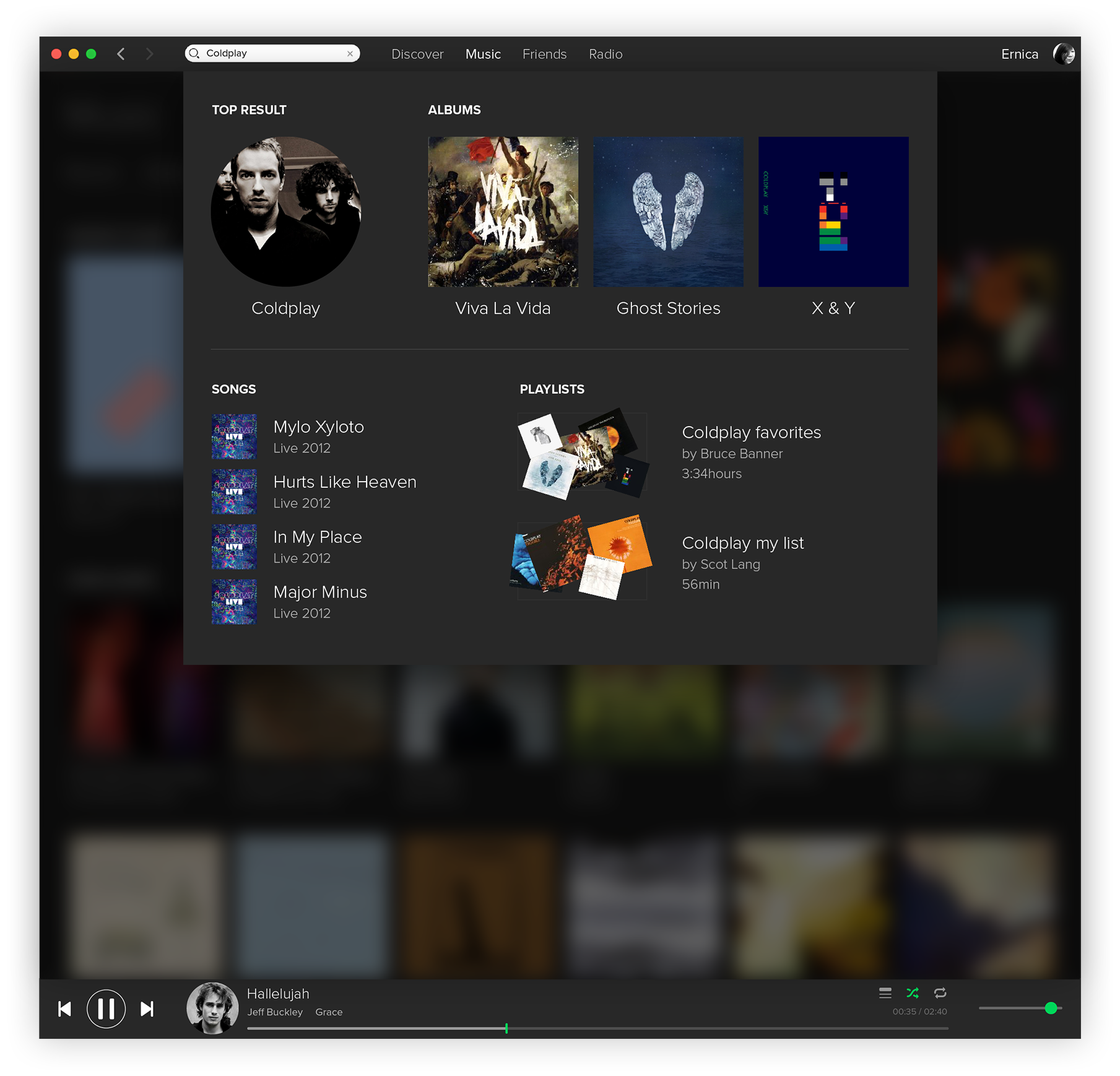
The last thing to do was to redo the instant search results overlay to make it more user-friendly and comfortable to use.
Impact
Predicting the Future
Within larger, more mature companies like Spotify, with millions of daily users, changes to the product often cannot happen as quickly as designers would like. Nevertheless, it’s bee heartening to see the rise of design systems and Spotify adopting some of the changes I’ve proposed through this project over the years since.
I took another five days to implement my work here on their Android app. Take a look here!
I took another five days to implement my work here on their Android app. Take a look here!